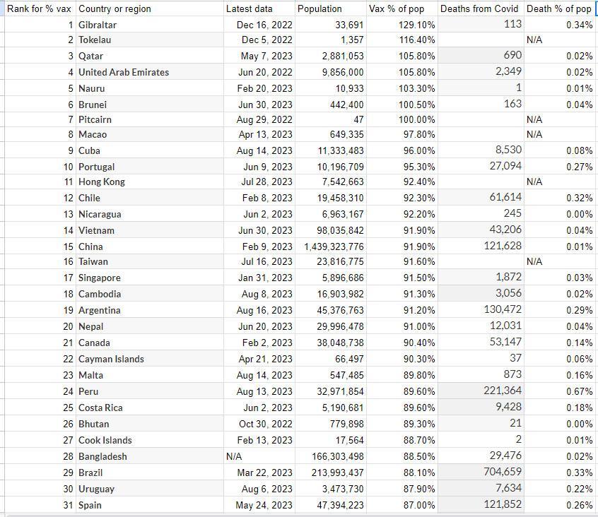
You have Jun 20, 2022 and Aug 14, 2023... That's more than an year discrepancy...
What is the source of "Death from Covid" and "Death % of pop"? How do you verify your "data"? :D
Seems like an excel table made by a kid. I can sort in excel as well. :D I've seen your posts, seems like you spam more when you should think more before you post. Just food for thought.
This is your peak around spring 2022. You can go to "table" tab to see text data. That column where I get the dates and the percentage of that country which was vaccinated for covid.
I use notepad++ where you hold the alt key and can select text vertically. Then using "sheets" in google, where top right with the icons you scroll down to sheets and it's like a spreadsheet with boxes. Pasting vertical copied stuff it goes properly in the boxes going down.
For the death data from covid, got that from here.
This is where you have all kinds of subsets of the data you can choose from. Your "metric" on the top you click that drop-down menu and choose what data you want showing up. I went to "confirmed deaths". Then you choose your "interval" from that drop down menu at the top, beside it. Went to "cumulative", I guess that means total deaths from covid since they started gathering data. This 'll be a chart, but you go to the tab at the bottom of the chart for "table", where you get columns of text for that info. You can sort by country on the left.. This is "total deaths". Then I'd copy all the text in there and paste in notepad++. Then select just the column of total deaths up to Aug 16, 2023. Paste that column in the google "sheets" program window.
Then I'd get the data of countries populations. In sheets can sort columns, but I had this column where I put numbers from 1-218 so I could re-sort it back that way. It was sorted by most vaxxed for covid, percentage. Sorted the countries alphabetically, copied that order, pasted in chatGPT, got it to name the country and population. Double checked that those were correct. Made column of population. Then I got chatGPT to calculate the death percentage of population. I pasted those 3 columns of country name, population and deaths from covid columns. And it calculated the death percentage. Doubled checked the data.. you'd take deaths, divide by population, then multiply by 100. Double check that by taking the population and multiplying it by the death percentage number. Data seemed correct.
They do not have this death percentage of the population data. They're trying to hide stuff, eh. That's why I wanted to do this spread sheet where I can see what the numbers are, beside each other.
I still don't get it. It seems a lot of work for little to no actual data. Sorry, I hope it works for you in some kind.
Do you say you have only one source for the data? You admit that the data can be altered...
Why use chatGPT when the excel formulas are much easier? Anyway, it shouldn't present differences in any way.
What is the aim of the spreadsheet? Why calculate this data?
Sorry, don't want to be insulting or something, just pragmatic. I could compile a better table for you, if you let me know what data you want to see. However, at this point, the vaccines given are scrambled with the double-triple vaxxed (not your table, just the general data). However, I would be happy to help you with spreadsheets.
It wasn't that much work, didn't have to manually calculate anything. There is data.. you have a column of the death percentage from covid of the population of each country. It's also alongside the percentage of each country that was vaccinated for covid. You don't see that data anywhere else.
You admit that the data can be altered...
Where do I admit that the data can be altered? I'm just using what numbers were at the official source from ourworldindata.org
Why use chatGPT when the excel formulas are much easier?
I don't have excel. Never used any sort of spreadsheet program before this.
What is the aim of the spreadsheet? Why calculate this data?
Because I was looking around for it, even asking Bing AI, and it couldn't find this type of data together on the same page, anywhere.
I could compile a better table for you, if you let me know what data you want to see.
Well, I just wanted to see these numbers together on the same page and compare, are the countries which are most vaccinated for covid, getting lower numbers of the death percentage of the population. You'd think countries with the lowest percentage of being vaccinated for covid, would have really high death counts. But it doesn't look that way, when you have this data, which is not elsewhere on the internet. Good enough, saw the data. No need for you to compile a better table.

You have Jun 20, 2022 and Aug 14, 2023... That's more than an year discrepancy...
What is the source of "Death from Covid" and "Death % of pop"? How do you verify your "data"? :D
Seems like an excel table made by a kid. I can sort in excel as well. :D I've seen your posts, seems like you spam more when you should think more before you post. Just food for thought.
Those are the data cut off dates. Countries stopped reporting and it drops off in the map if you move the slider right.
This data is all from this official site.
https://ourworldindata.org/grapher/share-people-vaccinated-covid?tab=map&time=2022-04-21&country=~OWID_WRL
This is your peak around spring 2022. You can go to "table" tab to see text data. That column where I get the dates and the percentage of that country which was vaccinated for covid.
I use notepad++ where you hold the alt key and can select text vertically. Then using "sheets" in google, where top right with the icons you scroll down to sheets and it's like a spreadsheet with boxes. Pasting vertical copied stuff it goes properly in the boxes going down.
For the death data from covid, got that from here.
https://ourworldindata.org/covid-vaccinations
This is where you have all kinds of subsets of the data you can choose from. Your "metric" on the top you click that drop-down menu and choose what data you want showing up. I went to "confirmed deaths". Then you choose your "interval" from that drop down menu at the top, beside it. Went to "cumulative", I guess that means total deaths from covid since they started gathering data. This 'll be a chart, but you go to the tab at the bottom of the chart for "table", where you get columns of text for that info. You can sort by country on the left.. This is "total deaths". Then I'd copy all the text in there and paste in notepad++. Then select just the column of total deaths up to Aug 16, 2023. Paste that column in the google "sheets" program window.
Then I'd get the data of countries populations. In sheets can sort columns, but I had this column where I put numbers from 1-218 so I could re-sort it back that way. It was sorted by most vaxxed for covid, percentage. Sorted the countries alphabetically, copied that order, pasted in chatGPT, got it to name the country and population. Double checked that those were correct. Made column of population. Then I got chatGPT to calculate the death percentage of population. I pasted those 3 columns of country name, population and deaths from covid columns. And it calculated the death percentage. Doubled checked the data.. you'd take deaths, divide by population, then multiply by 100. Double check that by taking the population and multiplying it by the death percentage number. Data seemed correct.
In the:
https://ourworldindata.org/covid-vaccinations
They do not have this death percentage of the population data. They're trying to hide stuff, eh. That's why I wanted to do this spread sheet where I can see what the numbers are, beside each other.
I still don't get it. It seems a lot of work for little to no actual data. Sorry, I hope it works for you in some kind.
Do you say you have only one source for the data? You admit that the data can be altered...
Why use chatGPT when the excel formulas are much easier? Anyway, it shouldn't present differences in any way.
What is the aim of the spreadsheet? Why calculate this data?
Sorry, don't want to be insulting or something, just pragmatic. I could compile a better table for you, if you let me know what data you want to see. However, at this point, the vaccines given are scrambled with the double-triple vaxxed (not your table, just the general data). However, I would be happy to help you with spreadsheets.
It wasn't that much work, didn't have to manually calculate anything. There is data.. you have a column of the death percentage from covid of the population of each country. It's also alongside the percentage of each country that was vaccinated for covid. You don't see that data anywhere else.
Where do I admit that the data can be altered? I'm just using what numbers were at the official source from ourworldindata.org
I don't have excel. Never used any sort of spreadsheet program before this.
Because I was looking around for it, even asking Bing AI, and it couldn't find this type of data together on the same page, anywhere.
Well, I just wanted to see these numbers together on the same page and compare, are the countries which are most vaccinated for covid, getting lower numbers of the death percentage of the population. You'd think countries with the lowest percentage of being vaccinated for covid, would have really high death counts. But it doesn't look that way, when you have this data, which is not elsewhere on the internet. Good enough, saw the data. No need for you to compile a better table.