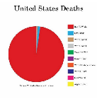
If it said "United States Deaths From Wars" then it would make no sense including abortion deaths. I maintain that it is an ill-conceived graph that drives a fair point, but does so dishonestly. Instead of allowing the reader to draw his own conclusion it bludgeons him with the statistician's own view.

If it said "United States Deaths From Wars" then it would make no sense including abortion deaths. I maintain that it is an ill-conceived graph that drives a fair point, but does so dishonestly. Instead of allowing the reader to draw his own conclusion it bludgeons him with the statistician's own view.