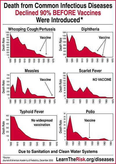
As expected, these graphs do not appear in this paper. OP and whoever created this shitty graphic are nothing but filthy liars.
Here's an interesting piece from the article though:
The major declines in child mortality that occurred in the first third of the 20th century have been attributable to a combination of improved socioeconomic conditions in this country and the public health strategies to protect the health of Americans. These public health measures included the establishment of local health departments in nearly all of the states. State and local health departments implemented these public health measures including water treatment, food safety, organized solid waste disposal, and public education about hygienic practices. These improvements in water and food safety and purity are linked to the major decline in diarrheal diseases seen in the early years of the century.44 Similarly, improvements in housing and decreased crowding in US cities are linked to the reductions in mortality from tuberculosis and other diseases attributable to person-to-person airborne transmission.43
Vaccination, while first used in the 18th century, became more widely implemented in the middle part of the century. Vaccines against diphtheria, tetanus, and pertussis became available during the late 1920s but only widely used in routine pediatric practice after World War II. Thus vaccination does not account for the impressive declines in mortality seen in the first half of the century. The reductions in vaccine-preventable diseases, however, are impressive. In the early 1920s, diphtheria accounted for about 175 000 cases annually and pertussis for nearly 150 000 cases; measles accounted for about half a million annual cases before the introduction of vaccine in the 1960s. Deaths from these diseases have been virtually eliminated, as have deaths from Haemophilus influenzae, tetanus, and poliomyelitis.45
So what these fucking liars did was take some diseases which were reduced due to better housing and sanitation and claim that this is true for all other diseases.
According to this shit quality pixelated low res image, this is the source:
https://www.semanticscholar.org/paper/Annual-summary-of-vital-statistics%3A-trends-in-the-Guyer-Freedman/f770a40bebcf2fcc7eb3e1e749e4e718b3cd4de9
As expected, these graphs do not appear in this paper. OP and whoever created this shitty graphic are nothing but filthy liars.
Here's an interesting piece from the article though:
So what these fucking liars did was take some diseases which were reduced due to better housing and sanitation and claim that this is true for all other diseases.