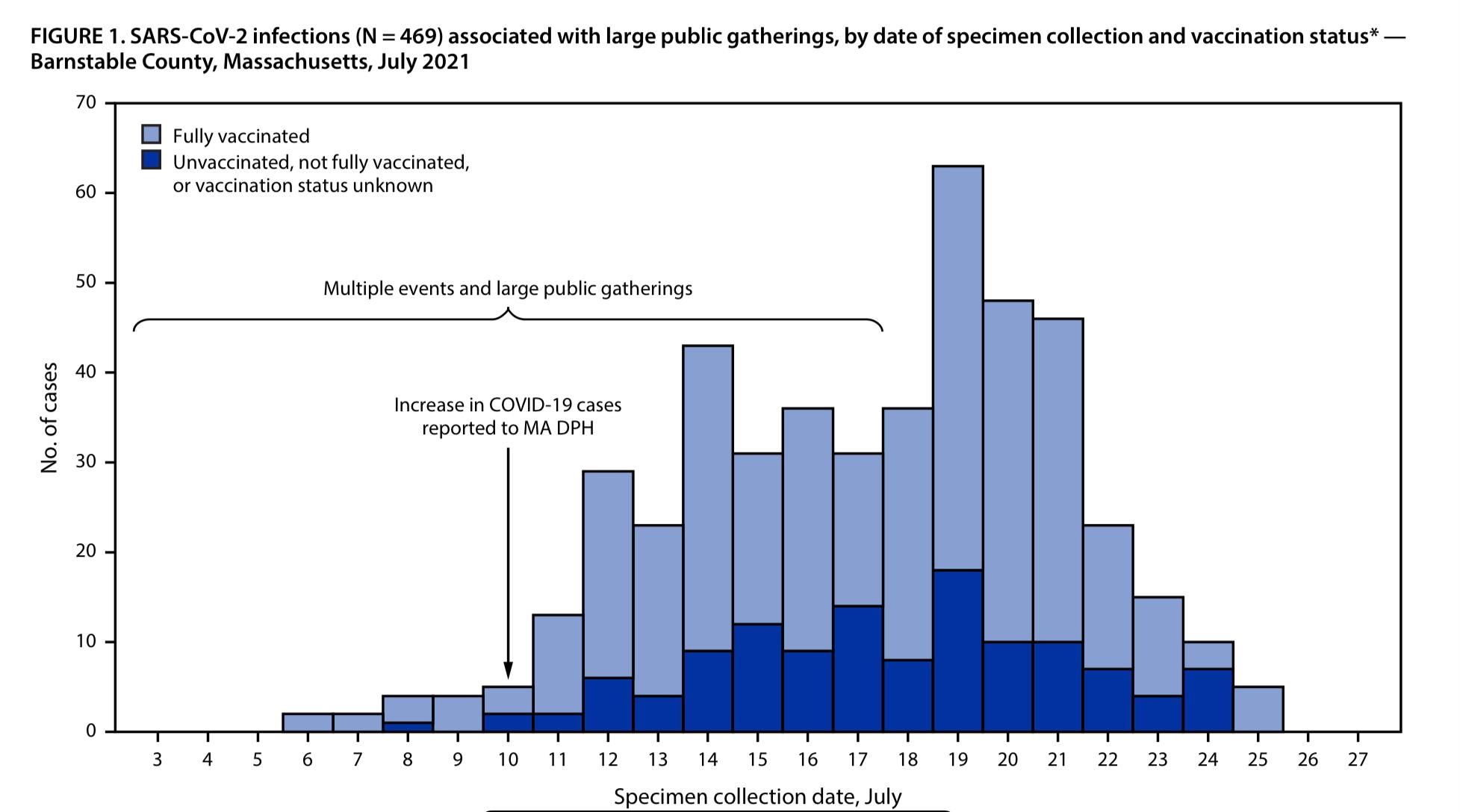
Regardless of any kind of discussion in to how real COVID is, These statistics are bad and misleading. The percentage of infected with vaccine is data that is routinely being misunderstood. By itself it is a useless statistic.
Here is why. If we had 1000 people vaxxed and 10 people not vaxxed then out of that population of 1010 people we had 2 people get infected, 1 vaxxed and 1 non-vaxxed this study would report 50% of the infected had the vaxx. This would give the impression that it is equally effective to have the vaxx or not. As well it gets worse with larger numbers. if the pool is 102 people are infected and 100 are vaxxed and 2 are not it would show that 99% of the infected are vaxxed giving an impression that the vaxx is worthless or even more deadly, but a comparison would show 20% of non-vaxxed are infected as opposed to 10% of vaxxed.
The appropriate statistic to study would by non-vaxxed infected vs vaxxed infected.
So why present the data in this way? Cause they are hiding something else. They do not want a comparative graph of % of vaxxed infected vs % of non-vaxxed infected because it looks more like for ever 100,000 vaxed 40 are getting infected for every 100,000 non-vaxxed 300 are getting infected. The most damaging number in this case becomes the pool. Out of a population of 200,000 people only 340 or ~0.2% are getting infected at all! The real statistics breaks down the entire model/industry of this garbage.
This is the CDC creating bad data and statistics either on purpose or out of shear incompetence.
We can do this normalization. I think we’re at ~70% vaxxed so the 3-4x incident rate in the sample is basically the same as saying there’s basically no difference in case occurrence rates between groups (since 70% is 2.7x the 30%)